
Karen Mahony and Alex Ukolov of Baba Studio, Part 1
“We don’t do simple projects,” Alex Ukolov told me. “Everything is a challenge.”
The challenges he refers to are artistic; with his wife and design partner, Karen Mahony, he runs the art studio Baba Studio and its publishing arm, Magic Realist Press. Together, Karen and Alex have designed seven Tarot decks, an oracle deck, and a range of books, as well as textile items such as bags, pouches, scarves, cushions, and entire costumes. Their most recent project is the brand-new Alice Tarot, based on Lewis Carroll’s classic novels Alice’s Adventures in Wonderland and Through the Looking-Glass.

How did this dynamic partnership develop? I found out in June 2014, when I visited them at their studio in Prague, the magical city in the Czech Republic where they have done all their Tarot work.
As you might imagine, their collaboration began with two accomplished artists and graphic designers looking for a new direction. Karen is originally from Belfast in the north of Ireland. Her family left early in “The Troubles,” the period of sectarian unrest and violence that most reckon to have begun in the 1960s and lasted until the 1990s. During this time, she lived in London, and she did her training and early work there; she was making and selling dresses in London boutiques by the time she was 16. After a year of art school, she took some time off to raise her son. Then, after doing a degree in English Literature and Computing she did her post-grad at the Royal College of Art. She studied computer graphics and human/computer interaction, ending up as a designer of software user interfaces. She worked for design agencies and then founded her own, creating user interfaces for “just about every big corporate client you can mention: British Telecom, British Airways, Reuters, the BBC.”

It was fun work for an artist, she said, but only in certain ways. “I liked the clients, a lot. People in corporates are often more fun than you would imagine. But I found the work lacking in creativity.” That lack of creativity contributed to a feeling of unease, which made the dot-com crash feel like a great opportunity to get out. She passed on the firm’s existing work to the staff members who wanted to carry on, and mothballed the rest of the company.
Karen had visited Prague several times, and felt a deep connection to the city. But now, some indefinable intuition told her she had to live there. To clarify her thoughts, she did a reading with Czech oracle cards. Surprisingly, they said if she moved to Prague she would meet a man with whom she would both fall in love and work. It seemed pretty farfetched, and anyway she wasn’t looking for love at the time...but it didn’t exactly discourage her either, so she made the move. Two months later, a clothing designer friend told her he knew a Russian designer she should meet. As she told the Tarot Garden website some years ago, “All I can say is - the cards were right!”
 The Russian in question was Alex Ukolov, at the time a Ukrainian citizen but an ethnic and linguistic Russian. Alex is from the Russian community in Crimea that was at the center of the recent annexation of the province back to Russia. He was born in Yalta, in 1964. As was common in the Soviet system, he was identified early as a talented artist and went through 13 years of rigorous training. “My first degree was as a painter, but I realized that I was not good enough to be a professional painter,” he said. “So I changed my focus to graphic design.”
Before this, however, he had to get through two years in the Soviet army. “It was a good time, because I had time to make up my mind and say I would do graphic design.” On finishing his service, Alex got a job in a film studio, but the disintegration of the Soviet system caused that job to vanish. He moved to Sebastopol, where he worked in advertising, eventually, like Karen, founding his own firm. He also married and started a family. Life was good, but he found the work unfulfilling. “I was doing boring advertising. We eventually decided to leave the country because it was getting worse and worse in creative terms. I thought spending 13 years in art training, it was a pity doing simple, ordinary advertisements.” The destination they chose was Prague, but after they arrived, the marriage split up.
Soon after that came his first meeting with Karen. “I saw his portfolio and thought ‘there’s something very interesting here,’” she remembered. “In essence he was more of an illustrator than a logo creator, which is what he’d been doing. There was a beautiful book of poetry that he’d done some amazing stuff with. He says that I became attracted to him because I saw the book of poetry!”
 At first, the pair decided to work together as a trio with their designer friend, and worked in textiles. But when their friend’s visa expired and he had to leave Prague, they found themselves a duo, and Karen remembered Alex’s skills as an illustrator. For their first major project, they dreamed up the now-iconic Tarot of Prague.
“We only decided to do Tarot because it seemed like a good idea for a first project,” Karen remembered. “We met and we began to work together quite quickly. We were trying to work out how to work together, still getting to know each other. We were both getting to know Prague, and we both felt very strongly about Prague. I thought, well, there’s never been a Tarot of Prague, and it just seemed like such an obvious thing to do, the magic city and all that.”
Karen had a longstanding love of magic, but no close connection to Tarot. “I used to do the Ouija board as a kid,” she remembered. “I probably shouldn’t admit to this, but I used to play with the Ouija board the way other kids had doll’s houses! And then I got very involved in yoga when I was 12, 13. It was at an Indian ashram, so then I got pulled aside and taught Hindu magic, sort of traditional spell-casting and things. I just stayed very interested in general. But not particularly interested in Tarot.”
Alex was even less well versed in the cards. “I knew absolutely nothing about Tarot,” he said. Tarot, at the time, was regarded with suspicion in Russia, and he experienced skepticism and hostility from Russian friends. “There are still lots of my friends in Russia who believe that I shouldn’t do that. People have no idea about what it is, they just think it’s evil and you shouldn’t touch it.”
At first, he approached the Tarot deck purely as an art project. “I was always interested in art history, art objects, imagery, unusual details. I just took this as an opportunity to discover Prague for myself.” But gradually, the more magical aspects of the project grew on him too. “I didn’t believe to begin with that Tarot could really work. So when I actually saw that it could work, I was very surprised. Karen did a reading, and it was accurate, and I began to think about how it works, and I started reading and discovering.”
 Before creating a Tarot deck, the couple had to choose an established system to model their deck on. As a Russian and an Irish person living in Central Europe, they could have created a Marseilles-style deck, a Thoth deck in the style designed by Aleister Crowley and executed by Lady Frieda Harris, or even a Tarock pack. Instead, they selected the system devised by Arthur Edward Waite and put into images by Pamela Colman Smith, often called the Rider-Waite-Smith or RWS deck. “I’m a bit prejudiced against Crowley, and I base that almost 100% on the fact that Yeats didn’t like him,” Karen laughed. “In terms of poetry, Yeats is my biggest hero, so I figure if Yeats kicked him out of the Golden Dawn….”
The Yeats-Crowley feud is not the only reason they went with the RWS images. With 78 fully illustrated cards, it’s the system that offers the most challenge to illustrators and the most imagery to Tarot readers. “It gives you a lot to work with,” Karen explained. “Also, Pamela Colman Smith was very theatrical and you can see it in her cards, and we’re quite theatrical in the way we do things, so there’s a nice fit there.
 With the general idea established that it was to be a RWS-based deck, an early step was lots of photography, which was perfect for people still getting to know their city. They visited not only the great and famous locations known the world over, but also more out-of-the way corners all over Prague. “In those days, we weren’t running an online shop or anything, so we could just do things like go out and spend the whole day photographing,” Karen said.
After taking thousands of photographs, to the point where Alex sometimes says he felt like a “madman who couldn’t stop photographing,” the couple had to decide what would go on each card. As you might imagine, some cards came easily and some were more difficult, but eventually they had concepts for each. Then, the trick was to combine photos of various kinds: landscapes and city views; photos of buildings and doorways; and photos of artworks in many media including paintings, woodcut prints, bronze reliefs and statues, stone sculptures, tile mosaics, and stained glass windows. Add to those a few photos of people, and some original drawings, and you have quite a lot of seemingly disparate elements that needed to be brought together.
 The solution was to make the deck look like a book of magical realist illustrations. “We tried to make it look more graphic, as if it were drawn,” Alex explained. “It was a Photoshop experience. I was learning different Photoshop techniques, because it’s a beautiful piece of software. What you can do with it is unlimited. So we found a look which we wanted to get, and we achieved it partly through the use of filters, and partly by redrawing.”
“It was done with great respect for Prague’s artistic legacy, which is so rich,” he continued. “For example, some pictures that we took in graveyards, like wall-paintings, were destroyed by time, and we had to restore them on the computer to be able to use them in the deck. It’s interesting to see now, because some locations have been restored, and had a different look. So we preserved the way it looked ten years ago.”
 “We wanted to reflect that idea that Prague was a very magical place,” Karen concluded. “And it really is, if you open yourself to it. All sorts of things happen here. Someone said to me, ‘you were channeling Prague.’ And in a way that’s what we were doing.”
 The Tarot of Prague established Magic Realist Press as a major force in Tarot. Voted top deck of the year at the Aeclectic Tarot Forum, and reviewed as a triumph, it was more of a success than they anticipated. “We were quite surprised!” Karen said. Alex pointed out that people sometimes use the deck and its accompanying book as a guidebook to visit Prague, since they included the addresses of the locations they photographed; it’s Tarot tourism at its best.
Although originally they conceived of the deck as “a one-off project, to get ourselves going,” they also wisely realized they might be onto something with Tarot. When considering ideas for another deck, they at first thought of creating the Tarot of London, and from there moving on to other cities. But they decided that would be too predictable. “We actually made the decision to do something that would be totally different,” Karen said.
Soon, they came to the same conclusion as many Tarotists before and since: it’s all about the cats! Their next project would be a cat-themed deck, the Baroque Bohemian Cats’ Tarot. It features photos of cats dressed in sumptuous Baroque costumes, acting out scenes that resemble the RWS card images, and set in beautiful locations in the Czech Republic, especially Prague and Česky Krumlov. One reason for this decision was simply that they love cats. Also, they point out that cat decks were not very common back when they conceived of theirs, and that such decks as the Tarot of the White Cats, Medieval Cats Tarot, and others began appearing soon after theirs.

For the Baroque Bohemian Cats’ Tarot, Alex’s work in film and Karen’s interest in textiles came in very handy. “We tried to apply more animation technique,” Alex explained. This entailed a complicated process that began with overall designs for each card, and continued through a series of steps that included making miniature Baroque costumes, which are an alluring feature of the deck. “We were working with a Finnish textile designer, Anna Hakkarainen,” Karen explained. “She had the ability to make miniature costumes. She’s a very serious person when she takes on a project, so she researched Baroque costumes and miniaturized real Baroque patterns.” For the beautiful dresses, frock-coats, waistcoats and breeches she devised, they used mostly light-colored silks and sateens (which made it possible to capture detailed photographs), and added trim, ribbons, beads, and buttons from antique and vintage shops.
 Once the costumes were ready, they used the characteristically Czech techniques of puppet animation to set the costumes into theatrical tableaux. Puppets were dressed up in the costumes, and posed according to the card designs. “Everything was set, like a small stage,” Alex explained. “It was photographed, and then edited in the computer.”
Another step, of course, was to photograph cats. Lots and lots of cats. This sounds simple, but it was one of the most challenging aspects of the deck. The cats had to be shot from the correct angles so that their heads and paws would be in the proper positions, with appropriate expressions, to match each card’s composition and meaning. “We went round cat breeders and the cat shelter here and just spent days and days and days photographing cats,” Karen remembered. “When you stand in front of a cat with a camera, and it’s a cat that’s never seen you before, it takes a long time before they begin to show any expression. For the first hour, the only expression you get is kind of a bored hostility.”
Nowadays, it’s possible the kinds of photos they needed, of cats in many different positions and poses, might be available via online photo libraries. But that was not the case ten years ago, and in any case taking their own photos produced better results. “Apart from having cat characters, we had to get the right expressions,” Alex explained. “And that is very difficult to find in a library. You might find a very expressive cat face, but it’s at the wrong angle! We had to apply different techniques like playing with them, and making them surprised.”
Note: In this article, all images of Baba Studio and Magic Realist Press products, including images of individual cards, are copyright Karen Mahony and Alex Ukolov, Baba Studio. The photo of Pamela Colman Smith and the cat postcard are in the Public Domain. The photo of Alex Ukolov and the photo of artwork in Prague are copyright Stephen Winick.
The challenges he refers to are artistic; with his wife and design partner, Karen Mahony, he runs the art studio Baba Studio and its publishing arm, Magic Realist Press. Together, Karen and Alex have designed seven Tarot decks, an oracle deck, and a range of books, as well as textile items such as bags, pouches, scarves, cushions, and entire costumes. Their most recent project is the brand-new Alice Tarot, based on Lewis Carroll’s classic novels Alice’s Adventures in Wonderland and Through the Looking-Glass.

How did this dynamic partnership develop? I found out in June 2014, when I visited them at their studio in Prague, the magical city in the Czech Republic where they have done all their Tarot work.
As you might imagine, their collaboration began with two accomplished artists and graphic designers looking for a new direction. Karen is originally from Belfast in the north of Ireland. Her family left early in “The Troubles,” the period of sectarian unrest and violence that most reckon to have begun in the 1960s and lasted until the 1990s. During this time, she lived in London, and she did her training and early work there; she was making and selling dresses in London boutiques by the time she was 16. After a year of art school, she took some time off to raise her son. Then, after doing a degree in English Literature and Computing she did her post-grad at the Royal College of Art. She studied computer graphics and human/computer interaction, ending up as a designer of software user interfaces. She worked for design agencies and then founded her own, creating user interfaces for “just about every big corporate client you can mention: British Telecom, British Airways, Reuters, the BBC.”

Karen Mahony at Baba Studio, Prague
It was fun work for an artist, she said, but only in certain ways. “I liked the clients, a lot. People in corporates are often more fun than you would imagine. But I found the work lacking in creativity.” That lack of creativity contributed to a feeling of unease, which made the dot-com crash feel like a great opportunity to get out. She passed on the firm’s existing work to the staff members who wanted to carry on, and mothballed the rest of the company.
Karen had visited Prague several times, and felt a deep connection to the city. But now, some indefinable intuition told her she had to live there. To clarify her thoughts, she did a reading with Czech oracle cards. Surprisingly, they said if she moved to Prague she would meet a man with whom she would both fall in love and work. It seemed pretty farfetched, and anyway she wasn’t looking for love at the time...but it didn’t exactly discourage her either, so she made the move. Two months later, a clothing designer friend told her he knew a Russian designer she should meet. As she told the Tarot Garden website some years ago, “All I can say is - the cards were right!”

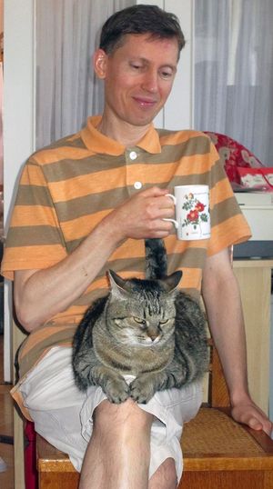
Alex Ukolov and friend
Before this, however, he had to get through two years in the Soviet army. “It was a good time, because I had time to make up my mind and say I would do graphic design.” On finishing his service, Alex got a job in a film studio, but the disintegration of the Soviet system caused that job to vanish. He moved to Sebastopol, where he worked in advertising, eventually, like Karen, founding his own firm. He also married and started a family. Life was good, but he found the work unfulfilling. “I was doing boring advertising. We eventually decided to leave the country because it was getting worse and worse in creative terms. I thought spending 13 years in art training, it was a pity doing simple, ordinary advertisements.” The destination they chose was Prague, but after they arrived, the marriage split up.
Soon after that came his first meeting with Karen. “I saw his portfolio and thought ‘there’s something very interesting here,’” she remembered. “In essence he was more of an illustrator than a logo creator, which is what he’d been doing. There was a beautiful book of poetry that he’d done some amazing stuff with. He says that I became attracted to him because I saw the book of poetry!”
 At first, the pair decided to work together as a trio with their designer friend, and worked in textiles. But when their friend’s visa expired and he had to leave Prague, they found themselves a duo, and Karen remembered Alex’s skills as an illustrator. For their first major project, they dreamed up the now-iconic Tarot of Prague.
“We only decided to do Tarot because it seemed like a good idea for a first project,” Karen remembered. “We met and we began to work together quite quickly. We were trying to work out how to work together, still getting to know each other. We were both getting to know Prague, and we both felt very strongly about Prague. I thought, well, there’s never been a Tarot of Prague, and it just seemed like such an obvious thing to do, the magic city and all that.”
Karen had a longstanding love of magic, but no close connection to Tarot. “I used to do the Ouija board as a kid,” she remembered. “I probably shouldn’t admit to this, but I used to play with the Ouija board the way other kids had doll’s houses! And then I got very involved in yoga when I was 12, 13. It was at an Indian ashram, so then I got pulled aside and taught Hindu magic, sort of traditional spell-casting and things. I just stayed very interested in general. But not particularly interested in Tarot.”
Alex was even less well versed in the cards. “I knew absolutely nothing about Tarot,” he said. Tarot, at the time, was regarded with suspicion in Russia, and he experienced skepticism and hostility from Russian friends. “There are still lots of my friends in Russia who believe that I shouldn’t do that. People have no idea about what it is, they just think it’s evil and you shouldn’t touch it.”
At first, he approached the Tarot deck purely as an art project. “I was always interested in art history, art objects, imagery, unusual details. I just took this as an opportunity to discover Prague for myself.” But gradually, the more magical aspects of the project grew on him too. “I didn’t believe to begin with that Tarot could really work. So when I actually saw that it could work, I was very surprised. Karen did a reading, and it was accurate, and I began to think about how it works, and I started reading and discovering.”

Pamela Colman Smith
The Yeats-Crowley feud is not the only reason they went with the RWS images. With 78 fully illustrated cards, it’s the system that offers the most challenge to illustrators and the most imagery to Tarot readers. “It gives you a lot to work with,” Karen explained. “Also, Pamela Colman Smith was very theatrical and you can see it in her cards, and we’re quite theatrical in the way we do things, so there’s a nice fit there.
 With the general idea established that it was to be a RWS-based deck, an early step was lots of photography, which was perfect for people still getting to know their city. They visited not only the great and famous locations known the world over, but also more out-of-the way corners all over Prague. “In those days, we weren’t running an online shop or anything, so we could just do things like go out and spend the whole day photographing,” Karen said.
After taking thousands of photographs, to the point where Alex sometimes says he felt like a “madman who couldn’t stop photographing,” the couple had to decide what would go on each card. As you might imagine, some cards came easily and some were more difficult, but eventually they had concepts for each. Then, the trick was to combine photos of various kinds: landscapes and city views; photos of buildings and doorways; and photos of artworks in many media including paintings, woodcut prints, bronze reliefs and statues, stone sculptures, tile mosaics, and stained glass windows. Add to those a few photos of people, and some original drawings, and you have quite a lot of seemingly disparate elements that needed to be brought together.
 The solution was to make the deck look like a book of magical realist illustrations. “We tried to make it look more graphic, as if it were drawn,” Alex explained. “It was a Photoshop experience. I was learning different Photoshop techniques, because it’s a beautiful piece of software. What you can do with it is unlimited. So we found a look which we wanted to get, and we achieved it partly through the use of filters, and partly by redrawing.”
“It was done with great respect for Prague’s artistic legacy, which is so rich,” he continued. “For example, some pictures that we took in graveyards, like wall-paintings, were destroyed by time, and we had to restore them on the computer to be able to use them in the deck. It’s interesting to see now, because some locations have been restored, and had a different look. So we preserved the way it looked ten years ago.”
As an example of the work they did, see the image below. On the left is Temperance from the Tarot of Prague. On the right is my own photo of the original artwork on which it is based, cropped in approximately the same places. This gives an idea of how much work the Baba team did in deconstructing, reconstructing, and coloring their photos, as well as digitally "cleaning" and "restoring" the art. They made the lady's figure shorter and removed the horizontal section marks, added the wings, cups, and stream of water to make the figure resemble the traditional Temperance card, removed the dirt from the artwork, brightened the colors, and applied other transformations as well.
 “We wanted to reflect that idea that Prague was a very magical place,” Karen concluded. “And it really is, if you open yourself to it. All sorts of things happen here. Someone said to me, ‘you were channeling Prague.’ And in a way that’s what we were doing.”
 The Tarot of Prague established Magic Realist Press as a major force in Tarot. Voted top deck of the year at the Aeclectic Tarot Forum, and reviewed as a triumph, it was more of a success than they anticipated. “We were quite surprised!” Karen said. Alex pointed out that people sometimes use the deck and its accompanying book as a guidebook to visit Prague, since they included the addresses of the locations they photographed; it’s Tarot tourism at its best.
Although originally they conceived of the deck as “a one-off project, to get ourselves going,” they also wisely realized they might be onto something with Tarot. When considering ideas for another deck, they at first thought of creating the Tarot of London, and from there moving on to other cities. But they decided that would be too predictable. “We actually made the decision to do something that would be totally different,” Karen said.
Soon, they came to the same conclusion as many Tarotists before and since: it’s all about the cats! Their next project would be a cat-themed deck, the Baroque Bohemian Cats’ Tarot. It features photos of cats dressed in sumptuous Baroque costumes, acting out scenes that resemble the RWS card images, and set in beautiful locations in the Czech Republic, especially Prague and Česky Krumlov. One reason for this decision was simply that they love cats. Also, they point out that cat decks were not very common back when they conceived of theirs, and that such decks as the Tarot of the White Cats, Medieval Cats Tarot, and others began appearing soon after theirs.

For the Baroque Bohemian Cats’ Tarot, Alex’s work in film and Karen’s interest in textiles came in very handy. “We tried to apply more animation technique,” Alex explained. This entailed a complicated process that began with overall designs for each card, and continued through a series of steps that included making miniature Baroque costumes, which are an alluring feature of the deck. “We were working with a Finnish textile designer, Anna Hakkarainen,” Karen explained. “She had the ability to make miniature costumes. She’s a very serious person when she takes on a project, so she researched Baroque costumes and miniaturized real Baroque patterns.” For the beautiful dresses, frock-coats, waistcoats and breeches she devised, they used mostly light-colored silks and sateens (which made it possible to capture detailed photographs), and added trim, ribbons, beads, and buttons from antique and vintage shops.
 Once the costumes were ready, they used the characteristically Czech techniques of puppet animation to set the costumes into theatrical tableaux. Puppets were dressed up in the costumes, and posed according to the card designs. “Everything was set, like a small stage,” Alex explained. “It was photographed, and then edited in the computer.”
Another step, of course, was to photograph cats. Lots and lots of cats. This sounds simple, but it was one of the most challenging aspects of the deck. The cats had to be shot from the correct angles so that their heads and paws would be in the proper positions, with appropriate expressions, to match each card’s composition and meaning. “We went round cat breeders and the cat shelter here and just spent days and days and days photographing cats,” Karen remembered. “When you stand in front of a cat with a camera, and it’s a cat that’s never seen you before, it takes a long time before they begin to show any expression. For the first hour, the only expression you get is kind of a bored hostility.”
Nowadays, it’s possible the kinds of photos they needed, of cats in many different positions and poses, might be available via online photo libraries. But that was not the case ten years ago, and in any case taking their own photos produced better results. “Apart from having cat characters, we had to get the right expressions,” Alex explained. “And that is very difficult to find in a library. You might find a very expressive cat face, but it’s at the wrong angle! We had to apply different techniques like playing with them, and making them surprised.”

Karen remembered one experience in particular, with a mother cat whose kittens were being photographed in a lengthy session. “She put up with it for an hour and a half, and she was quite good and we used quite a lot of her photos. And then, at the end of an hour and a half, she comes over, picks up each kitten in turn, and puts them behind the sofa, then turns round to us and spits! That was like saying, ‘the photo session is now over!’”
In many of the cards the cats are placed in historical locations. Some of these are in Prague, and some are in the Renaissance town of Česky Krumlov, which has meticulously maintained Baroque interiors. Many of them also feature outdoor scenes, especially at Vrtbovská Zahrada, a Baroque garden famous for its lush beauty. This required another set of photo-shoots, which demanded a different set of skills: outdoor location photography, to furnish the backgrounds for many cards. Luckily, the Tarot of Prague had prepared them for this aspect of the deck.
 So the costumes and sets were made and photographed. The cat characters were found, befriended, and captured on camera. The background scenes were shot. Then it was back to the computer to create the final images. The work was painstaking: each puppet’s head, hands, and legs had to be replaced with feline counterparts; tails had to be judiciously added; masks and other costume elements had to be composited in; and the whole had to be set in the proper palace room or garden scene. The lighting, color, shadow, and composition had to be adjusted to make each card a realistic yet whimsical scene.
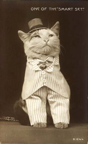
Looking closely at the Baroque Bohemian Cats’ Tarot, one notices a palpable difference in the image quality from the Tarot of Prague. “The difference was that we didn’t try to make it look more graphic,” Alex explained. “You can still see its photographic quality.” Indeed, the deck’s impressive realism and its whimsical quality are both enhanced by the illusion that cats are really acting this way; this in turn requires the photographic look. The result is like a combination of magnificent Baroque paintings and the pioneering cat photos of the nineteenth and early twentieth centuries (like the 1906 picture postcard below).
 “For us, in illustration terms, the Baroque Bohemian Cats’ Tarot was very interesting because it pushed us,” Karen said. Sadly, though, it was not very well received at first. “It shocked a lot of people at the time,” Karen remembered, “because they thought the Tarot of Prague was very serious and showed a lot of interest in the occult. [With the Baroque Bohemian Cats’ Tarot] they thought we’d become very trivial, and kitschy. We took a lot of negative flak for that.” In particular, Karen remembered a visit from a top modernist designer during the creation of the deck: “The guy actually went physically white, he was so shocked and horrified!”
So much the better: Karen and Alex had both spent years creating art to serve a corporate, modernist aesthetic and agenda, and that certainly wasn’t what they wanted in their Tarot work. Moreover, it established them as a design team with an unpredictable approach. “We just thought if we did something else that was similar to the Tarot of Prague, we’d kind of get pigeon-holed,” Karen explained. “And you do see a lot of deck people doing that: they get known for a particular kind of thing, and then that’s kind of it. And we didn’t want to do that, and I’m glad we didn’t.”
In the end, it paid off, with the Baroque Bohemian Cats’ Tarot becoming one of their most successful projects, and even becoming an early trendsetter in the genre of cat Tarots. “It’s a very odd deck, because it’s almost grown more successful year by year. I think people have to some extent ‘got’ it now. Obviously, it wasn’t meant to be serious in terms of the theory of magic, but it was serious in the sense that we wanted to do something very beautiful and decorative that would be fun to use.”
 They were quick to use the costumes, cat photos, and other elements to create interesting side projects as well. In particular, they created a lushly illustrated storybook, Bohemian Cats, set in a mythical Bohemia ruled by cats. The larger page sized offered by the book allow the photos to be even more impressive, and they enhanced this effect by adding several fold-out three-page spreads. The project uses their photos of Vrtbovská Zahrada, and of the castle and Baroque theater in Česky Krumlov to great effect. The similar project Shadow of the Vampuss is a tongue-in-cheek retelling of Dracula (or in this case, Scratchula) as a graphic novel featuring cats. Once again, certain of the tableaux are more impressive than they could achieve in the small scope of a Tarot card, including scenes set in an apothecary shop and in Van Helsing's laboratory.
 Their work on the Baroque Bohemian Cats' Tarot was also useful experience for the future. “It was quite experimental, and it took us quite a while to work out how to do it,” Karen said. “But it put us in a very very strong position for understanding how to do something like the Alice Tarot. We needed that experience. If we didn’t do the Baroque Bohemian Cats’ Tarot, we’d never have had the technique to do Alice.”
Both their early decks, Karen explained, put a lot of emphasis on the combination of photographs and illustrations in the same image, which most photographers and most illustrators haven’t mastered. “You’ve got to have illustrative knowledge,” she explained. “It’s stuff like being sure you’ve photographed at the right angle and in the right light.” These qualities have to match up among all the collaged elements to make an image cohesive, and even when they do, laborious adjustment is often necessary. In photographic and collage tarot decks, Karen and Alex point out, these problems are often not understood or addressed. “Some [collage decks] are well done, but some are just appallingly done in illustrative terms!” As someone who has bought my share of such decks sight-unseen from Etsy, I must say I agree with their professional opinion: the best such decks, like those of Baba Studio and Kat Black, are beautiful…but many aren’t worth the money.
 Perhaps because of the challenges involved in the collage process, the Magic Realist team looked to an entirely different method for their third deck, the Fairytale Tarot. This beautiful deck is pure storybook illustration in a Central European style, colored in rich jewel tones. Each card features a scene from a fairytale, conceived by Karen and Alex, drawn by Czech artist Irena Trísková, and composed and colored by Alex.
As with most of their decks, the idea originated with Karen. “All our decks tend to be my idea,” she said. “And it’s not that I don’t say to Alex every fortnight, ‘what would you really like to do?’ I do! But he’s not very happy coming up with concepts. I like that. I’m very good at starting things, and he’s very good at completing them.”
 So why fairytales? “I've been interested in fairytales for years,” Karen said. “In fact, it was through this interest that I ended up reading English Lit at university—a lecturer who had a special interest in fairytale invited me to sit in in his lectures, and I ended up applying for a degree. Alex and I also have a very personal connection to fairytale. I used to tell a particular fairytale to any man I was involved with and ask them what they understood by it. Only Alex, of all the men I have known, gave the correct answer (and already knew the tale, by the way!)”
In these days of numerous fairy-themed Tarot decks, it’s a good idea to point out that this deck is based on fairytales in the literary sense; since Madame D’Aulnoy in the mid-seventeenth century, the word “fairytale” has been used to describe folktales or literary tales in which people experience magical situations. Famous examples are “Cinderella,” “Jack and the Beanstalk,” “The Snow Queen,” and “Hansel and Gretel.” Such stories are often called “wonder tales” or “magic tales” by English-language folklorists, or referred to by the German term märchen, since they only rarely actually concern fairies.
 Relating these traditional fairytales to Tarot cards presented another challenge to the Baba team: “There is so much contained in each fairytale,” Karen marveled. “Most tales are multi-layered.” The result of this is that there is a greater range of interpretations for each card than in traditional Tarot, depending on how well the reader knows fairytales. In fact, many readers have reported that the deck works as a cross between a Tarot deck and a fairytale-themed oracle. “It can be read by the fairytale alone,” Karen explained. “The traditional tarot meanings are not essential to a reading. This has good and bad aspects—it's certainly not a deck for someone who isn't prepared to familiarize themselves with the tales.”
Karen’s university work provided an initial source of fairytale knowledge. The Baba team, who are interested in both fairytales and illustrations, have a large collection of antique fairytale books from many cultures, and they acquired more for their research. Finally, they used the online texts archive maintained by D.L. Ashliman at the University of Pittsburgh.
The collaboration with Irena Trísková began when they saw the artist’s work in a local gallery and met her soon after. The process they used translated Karen and Alex’s ideas about fairytales into the style of an accomplished artist. Karen and Alex scripted each card, deciding which scene from which tale it would feature, and even did sketches. Trísková translated those sketches into detailed and beautiful drawings, which then were colored by Alex, with input throughout the process by Karen. “I think it would be fair to say that in the end it was 50-50 illustrated by Irena and Alex,” Karen said.
 The Fairytale Tarot was an immediate success, which Karen says surprised them. “The deck is demanding—it really won't work if you only know a handful of fairy stories,” she said. She also pointed out, however, that the companion book helps, by containing summaries of the stories. I would add that many Tarot readers read by using a combination of traditional card meanings already known to them, and their intuitive reaction to whatever image the card contains. For this reason, the evocativeness of the images may be more important to an individual reader’s reaction to the cards than previous fairytale knowledge.
Theories aside, all we know for sure is that people like it. “Interestingly enough, the deck has been championed particularly in Russia, and there is even talk of a Russian edition now,” Karen said.
As for their own reaction, they love the deck but feel ambivalent about the illustration style being so different from their own. “The whole point of a collaboration is to achieve different styles, of course, so in that way it was successful,” Karen said. “But it was a deck that made us seriously consider whether we wanted to go in the direction of publishing other people's work, and we have done very little of this since. In a way, it helped us to decide to be primarily a studio, not a publisher.”
 The Baba team’s next project was a pair of decks focused on the 19th century French artist J.J. Grandville, the Fantastic Menagerie Tarot and the Victorian Flower Oracle. Grandville was a pioneering artist in depicting animals wearing clothes and engaged in human behavior; in this way, his work was a direct precursor of the Baroque Bohemian Cats’ Tarot. Alex and Karen had always been fans of Grandville’s work, and were able to buy an original set of hand-colored Grandville books with damaged covers, which reduced the price from thousands to mere hundreds of dollars. They used these books to create their decks.
Although Karen was involved in the preparation of the Grandville decks, she became ill during their creation and was not as emotionally involved in them; in fact, she signed off on the proofs from a hospital bed. But Alex said they still enjoyed playing tribute to Grandville. “It wasn’t so intense,” he said. “Grandville had such a great sense of humor, we could enjoy it.” Although Grandville’s illustrations often required some disassembling and reassembling to match the cards’ vertical format, the Baba team didn’t change the animals or the flowers Grandville illustrated. “If a character is drawn a certain way,” Karen said, “we kept it that way.”
In some ways, they consider the Grandville projects “filler decks” between more serious and challenging projects, but their focus on Victorian illustrations added another set of experiences to their toolbox, which they used in their next deck, the Victorian Romantic Tarot.
Read About Karen and Alex's most famous decks, the Victorian Romantic Tarot and the Bohemian Gothic Tarot, as well as the brand-new Alice Tarot, in Part 2!
In many of the cards the cats are placed in historical locations. Some of these are in Prague, and some are in the Renaissance town of Česky Krumlov, which has meticulously maintained Baroque interiors. Many of them also feature outdoor scenes, especially at Vrtbovská Zahrada, a Baroque garden famous for its lush beauty. This required another set of photo-shoots, which demanded a different set of skills: outdoor location photography, to furnish the backgrounds for many cards. Luckily, the Tarot of Prague had prepared them for this aspect of the deck.
 So the costumes and sets were made and photographed. The cat characters were found, befriended, and captured on camera. The background scenes were shot. Then it was back to the computer to create the final images. The work was painstaking: each puppet’s head, hands, and legs had to be replaced with feline counterparts; tails had to be judiciously added; masks and other costume elements had to be composited in; and the whole had to be set in the proper palace room or garden scene. The lighting, color, shadow, and composition had to be adjusted to make each card a realistic yet whimsical scene.
 Looking closely at the Baroque Bohemian Cats’ Tarot, one notices a palpable difference in the image quality from the Tarot of Prague. “The difference was that we didn’t try to make it look more graphic,” Alex explained. “You can still see its photographic quality.” Indeed, the deck’s impressive realism and its whimsical quality are both enhanced by the illusion that cats are really acting this way; this in turn requires the photographic look. The result is like a combination of magnificent Baroque paintings and the pioneering cat photos of the nineteenth and early twentieth centuries (like the 1906 picture postcard below).

The long history of 'cats in clothes' pictures
So much the better: Karen and Alex had both spent years creating art to serve a corporate, modernist aesthetic and agenda, and that certainly wasn’t what they wanted in their Tarot work. Moreover, it established them as a design team with an unpredictable approach. “We just thought if we did something else that was similar to the Tarot of Prague, we’d kind of get pigeon-holed,” Karen explained. “And you do see a lot of deck people doing that: they get known for a particular kind of thing, and then that’s kind of it. And we didn’t want to do that, and I’m glad we didn’t.”
In the end, it paid off, with the Baroque Bohemian Cats’ Tarot becoming one of their most successful projects, and even becoming an early trendsetter in the genre of cat Tarots. “It’s a very odd deck, because it’s almost grown more successful year by year. I think people have to some extent ‘got’ it now. Obviously, it wasn’t meant to be serious in terms of the theory of magic, but it was serious in the sense that we wanted to do something very beautiful and decorative that would be fun to use.”
 They were quick to use the costumes, cat photos, and other elements to create interesting side projects as well. In particular, they created a lushly illustrated storybook, Bohemian Cats, set in a mythical Bohemia ruled by cats. The larger page sized offered by the book allow the photos to be even more impressive, and they enhanced this effect by adding several fold-out three-page spreads. The project uses their photos of Vrtbovská Zahrada, and of the castle and Baroque theater in Česky Krumlov to great effect. The similar project Shadow of the Vampuss is a tongue-in-cheek retelling of Dracula (or in this case, Scratchula) as a graphic novel featuring cats. Once again, certain of the tableaux are more impressive than they could achieve in the small scope of a Tarot card, including scenes set in an apothecary shop and in Van Helsing's laboratory.
 Their work on the Baroque Bohemian Cats' Tarot was also useful experience for the future. “It was quite experimental, and it took us quite a while to work out how to do it,” Karen said. “But it put us in a very very strong position for understanding how to do something like the Alice Tarot. We needed that experience. If we didn’t do the Baroque Bohemian Cats’ Tarot, we’d never have had the technique to do Alice.”
Both their early decks, Karen explained, put a lot of emphasis on the combination of photographs and illustrations in the same image, which most photographers and most illustrators haven’t mastered. “You’ve got to have illustrative knowledge,” she explained. “It’s stuff like being sure you’ve photographed at the right angle and in the right light.” These qualities have to match up among all the collaged elements to make an image cohesive, and even when they do, laborious adjustment is often necessary. In photographic and collage tarot decks, Karen and Alex point out, these problems are often not understood or addressed. “Some [collage decks] are well done, but some are just appallingly done in illustrative terms!” As someone who has bought my share of such decks sight-unseen from Etsy, I must say I agree with their professional opinion: the best such decks, like those of Baba Studio and Kat Black, are beautiful…but many aren’t worth the money.
 Perhaps because of the challenges involved in the collage process, the Magic Realist team looked to an entirely different method for their third deck, the Fairytale Tarot. This beautiful deck is pure storybook illustration in a Central European style, colored in rich jewel tones. Each card features a scene from a fairytale, conceived by Karen and Alex, drawn by Czech artist Irena Trísková, and composed and colored by Alex.
 As with most of their decks, the idea originated with Karen. “All our decks tend to be my idea,” she said. “And it’s not that I don’t say to Alex every fortnight, ‘what would you really like to do?’ I do! But he’s not very happy coming up with concepts. I like that. I’m very good at starting things, and he’s very good at completing them.”
 So why fairytales? “I've been interested in fairytales for years,” Karen said. “In fact, it was through this interest that I ended up reading English Lit at university—a lecturer who had a special interest in fairytale invited me to sit in in his lectures, and I ended up applying for a degree. Alex and I also have a very personal connection to fairytale. I used to tell a particular fairytale to any man I was involved with and ask them what they understood by it. Only Alex, of all the men I have known, gave the correct answer (and already knew the tale, by the way!)”
In these days of numerous fairy-themed Tarot decks, it’s a good idea to point out that this deck is based on fairytales in the literary sense; since Madame D’Aulnoy in the mid-seventeenth century, the word “fairytale” has been used to describe folktales or literary tales in which people experience magical situations. Famous examples are “Cinderella,” “Jack and the Beanstalk,” “The Snow Queen,” and “Hansel and Gretel.” Such stories are often called “wonder tales” or “magic tales” by English-language folklorists, or referred to by the German term märchen, since they only rarely actually concern fairies.
 Relating these traditional fairytales to Tarot cards presented another challenge to the Baba team: “There is so much contained in each fairytale,” Karen marveled. “Most tales are multi-layered.” The result of this is that there is a greater range of interpretations for each card than in traditional Tarot, depending on how well the reader knows fairytales. In fact, many readers have reported that the deck works as a cross between a Tarot deck and a fairytale-themed oracle. “It can be read by the fairytale alone,” Karen explained. “The traditional tarot meanings are not essential to a reading. This has good and bad aspects—it's certainly not a deck for someone who isn't prepared to familiarize themselves with the tales.”
Karen’s university work provided an initial source of fairytale knowledge. The Baba team, who are interested in both fairytales and illustrations, have a large collection of antique fairytale books from many cultures, and they acquired more for their research. Finally, they used the online texts archive maintained by D.L. Ashliman at the University of Pittsburgh.
The collaboration with Irena Trísková began when they saw the artist’s work in a local gallery and met her soon after. The process they used translated Karen and Alex’s ideas about fairytales into the style of an accomplished artist. Karen and Alex scripted each card, deciding which scene from which tale it would feature, and even did sketches. Trísková translated those sketches into detailed and beautiful drawings, which then were colored by Alex, with input throughout the process by Karen. “I think it would be fair to say that in the end it was 50-50 illustrated by Irena and Alex,” Karen said.
 The Fairytale Tarot was an immediate success, which Karen says surprised them. “The deck is demanding—it really won't work if you only know a handful of fairy stories,” she said. She also pointed out, however, that the companion book helps, by containing summaries of the stories. I would add that many Tarot readers read by using a combination of traditional card meanings already known to them, and their intuitive reaction to whatever image the card contains. For this reason, the evocativeness of the images may be more important to an individual reader’s reaction to the cards than previous fairytale knowledge.
Theories aside, all we know for sure is that people like it. “Interestingly enough, the deck has been championed particularly in Russia, and there is even talk of a Russian edition now,” Karen said.
As for their own reaction, they love the deck but feel ambivalent about the illustration style being so different from their own. “The whole point of a collaboration is to achieve different styles, of course, so in that way it was successful,” Karen said. “But it was a deck that made us seriously consider whether we wanted to go in the direction of publishing other people's work, and we have done very little of this since. In a way, it helped us to decide to be primarily a studio, not a publisher.”

Fantastic Menagerie Tarot
Although Karen was involved in the preparation of the Grandville decks, she became ill during their creation and was not as emotionally involved in them; in fact, she signed off on the proofs from a hospital bed. But Alex said they still enjoyed playing tribute to Grandville. “It wasn’t so intense,” he said. “Grandville had such a great sense of humor, we could enjoy it.” Although Grandville’s illustrations often required some disassembling and reassembling to match the cards’ vertical format, the Baba team didn’t change the animals or the flowers Grandville illustrated. “If a character is drawn a certain way,” Karen said, “we kept it that way.”
In some ways, they consider the Grandville projects “filler decks” between more serious and challenging projects, but their focus on Victorian illustrations added another set of experiences to their toolbox, which they used in their next deck, the Victorian Romantic Tarot.
Read About Karen and Alex's most famous decks, the Victorian Romantic Tarot and the Bohemian Gothic Tarot, as well as the brand-new Alice Tarot, in Part 2!
Note: In this article, all images of Baba Studio and Magic Realist Press products, including images of individual cards, are copyright Karen Mahony and Alex Ukolov, Baba Studio. The photo of Pamela Colman Smith and the cat postcard are in the Public Domain. The photo of Alex Ukolov and the photo of artwork in Prague are copyright Stephen Winick.